This website uses cookies so that we can provide you with the best user experience possible. Cookie information is stored in your browser and performs functions such as recognising you when you return to our website and helping our team to understand which sections of the website you find most interesting and useful.
WC Store Locator plugin helps you to embed Google Maps in your responsive website so the maps resize automatically based on the screen size of the visitor’s browser.
Responsive Google Map
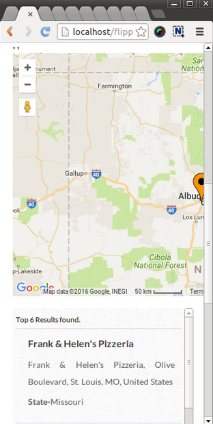
If you resize the browser or view the page on a small device, the embedded map would adjust its size automatically based on your screen size.
-
Access Settings Page
In the WC Store Locator plugin, navigate to the Settings Page.
-
Configure Map Width
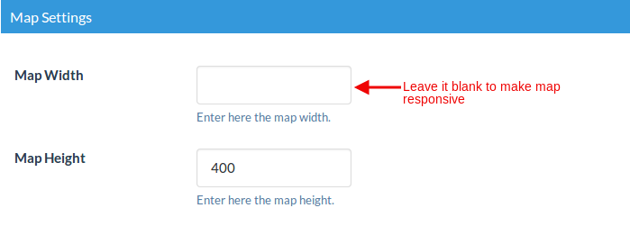
In the Map Setting section, leave the Map width field blank to make the map responsive.

-
Save and Test
Click on Save Map and open it in your browser. Your map will now be responsive. Try resizing your browser window to see it in action.

-
Access WP Post Pro Plugin
For a different guide, first, click on Manage Rules in the WP Post Pro Plugin. This will display a list of all created rules in a new window.
Non Responsive Google Maps
-
Configure Non-Responsive Map
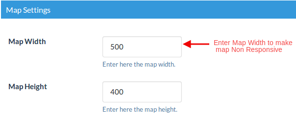
To make the map non-responsive, enter any value in the Map width field.

-
Save Settings
Click on Save Settings.
Your map will now be non-responsive. Try resizing your browser to see it in action.

Explore the latest in WordPress
Trying to stay on top of it all? Get the best tools, resources and inspiration sent to your inbox every Wednesday.
